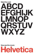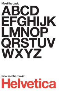


Review of Helvetica (2007) by Alice B — 24 May 2008
For me, the most interesting part of this documentary was about halfway through, when the interviewees discussed postmodernism - specifically, the grunge movement, when artists began to rebel against the ubiquitous use of Helvetica and instead used blurry, layered, and in some cases almost illegible typefaces to illustrate their disgust with capitalism and corporate consumerism in modern society.
As for the rest of the film, it was obviously "designed for designers," and it was interesting from that perspective, but I felt the history of Helvetica could have been summed up in a half-hour, tops, rather than extending it into a full feature-length documentary.
This review of Helvetica (2007) was written by Alice B on 24 May 2008.
Helvetica has generally received positive reviews.
Was this review helpful?