Review of Helvetica (2007) by Andrew W — 29 Nov 2007
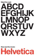
This was really interesting. It was full of dudes that would be simultaneously awesome and terrible to talk to. How great would it be to meet the guy that invented Georgia and Verdana? Totally great. Anyway, both the pro-Helvetica dudes and the anti-Helvetica dudes had good points, but I didn't see any font in the film that looked better than Helvetica. The guy at the end talking about how this generation is more aware of visual communication because of the opportunities to customise your webspace, so that your choice of font on your Myspace page becomes the same as your choice of wallpaper in your apartment was totally on the money I thought.
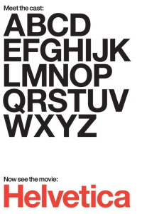
Summary: Helvetica looks dumb in caps; looks awesome in lower-case.
This review of Helvetica (2007) was written by Andrew W on 29 Nov 2007.
Helvetica has generally received positive reviews.
Was this review helpful?