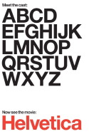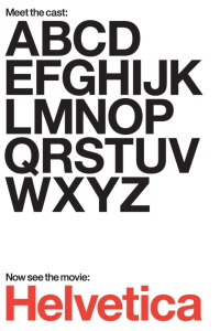

Review of Helvetica (2007) by Carissa S — 28 May 2008
A fascinating and well constructed documentary that uses Helvetica type as a jumping off point for a more general discussion of design, fonts and their impact on our lives. Once we get into the wretched grunge design period and the slightly better contemporary design period, it begins to loose its sense of pacing.
It also has about 2 too many montages of Helvetica type on various signs.
This review of Helvetica (2007) was written by Carissa S on 28 May 2008.
Helvetica has generally received positive reviews.
Was this review helpful?
Yes
No