Review of Helvetica (2007) by Stephen P — 18 Dec 2008
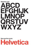
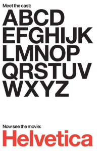
I was interested in this seeing this film, mostly because I didn't understand how this film could possibly be interesting. As a child of the PC age, Helvetica was just another font to me. I knew that it was one of the first few generic fonts available along with Palatino and Times. I typically used the latter two, however, in personal documents or academic work. Before I saw the movie I was unaware of just how long Helvetica had been around or how ubiquitous it is. I was also ignorant of the symbolism that surrounded its introduction as well as of the debate that goes on among typographers, other graphic designers, and image consultants over the font's aesthetic and symbolic merits.
This debate is the focus of the bulk of the film and, honestly, it drags on a bit too much for the disinterested layperson viewer. What caught my interest is the passion at play regarding Helvetica. If I were to paraphrase the font's swelling proponents, I would have to resort to the language of absolutism, dubbing Helvetica as the "gold standard" for corporate branding and the "Platonic ideal" of a sans-serif font. There is, however, an equally impassioned cohort of people who, for certain reasons, associate Helvetica with fascism, the military-industrial complex, and/or the decay of society. The documentary doesn't take sides, but after seeing it, you will never be able to to look at Helvetica, the font, the same way again, as you will always notice it, and always see in it more than merely the type, but also a political statement.
This review of Helvetica (2007) was written by Stephen P on 18 Dec 2008.
Helvetica has generally received positive reviews.
Was this review helpful?