Review of Helvetica (2007) by Ryan G — 31 Jul 2009
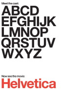
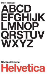
This weekend, I had the privilege to watch a documentary called Helvetica, concerning the history and popularity of the titular typeface. That's right - a feature length documentary about a font. And I enjoyed it! I think the story of this particular way to print letters was interesting, informative, and - get this - engaging. I know, right?
Helvetica was named as an alteration of the Latin for Switzerland, and means "Swiss." Intended to become the iconic representation of the Swiss nation in print, the typeface exploded as the epitome of form and function in lettering. Popularized in the fifties and sixties as a "modernist" typeface, major corporations decided to make the transition in their corporate identity, using Helvetica as a sign of their progressive thinking and efficiency. Today, the typeface is among the most recognizable in the world, used in everything from corporate logos to signs for public restrooms.
I actually had an excellent time learning about a world completely alien to me before, and now know more than I ever thought I would about typefaces. Turns out, Arial was a font invented by Microsoft (who, ironically, uses Helvetica in their corporate logo) to combat Apple's monopolization of Helvetica in their operating system. Definitely give this documentary a chance, it's quite interesting and painless. I give it an 80%, because now I can recognize Helvetica anywhere. M.
This review of Helvetica (2007) was written by Ryan G on 31 Jul 2009.
Helvetica has generally received positive reviews.
Was this review helpful?