Review of Helvetica (2007) by Mjs M — 19 Jan 2008
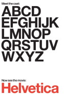
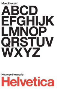
What do American Apparel, the British version of "The Office", the movie "Jackass", tupperware and government forms have in common? More than it first appears, posits Gary Hustwit's documentary, "Helvetica". (Disappointingly, the answer is not "they all star Steve-O.") Font enthusiasts (you're undoubtedly out there) have probably already guessed the connection between the five seemingly disparate things listed above, simply from reading the title of the documentary that links them: all five employ the popular Helvetica typeface (the logos for the first four are written in Helvetica; so are most government forms). "So what?", you ask. Thatâ??s part of the beauty of "Helvetica"---by the time the film's done, you kinda want to care about design choices and font use. Hustwit tracks the evolution of now-ubiquitous Helvetica---from its humble creation in a Swiss typeface foundry, to its domination of 60s design (as corporations embraced its simple cleanness and clarity), to the rebellion that it inspired in post-60s designers sick of homogeneity. One designer links the Helvetica typeface to the ethos behind the Vietnam war, and to fascism. It's hard to embrace her logic, but interesting to see a connection drawn between font and politics. "Helvetica" raises questions about artistic limitation, democracy, and corporate branding---pretty impressive for a doc that at first glance, appears to be a slight little movie made for design junkies and word nerds.
By me, The Coast.
This review of Helvetica (2007) was written by Mjs M on 19 Jan 2008.
Helvetica has generally received positive reviews.
Was this review helpful?