Review of Helvetica (2007) by Walter M — 02 Jun 2008
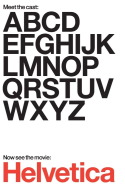
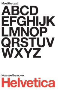
[font=Century Gothic]"Helvetica" is an illuminating documentary about how even the things we take for granted may have a more complex story than we originally imagined. Take the font Helvetica for instance.
Did you know Helvetica is from the Latin word for Swiss and that it is the default font for municipalities and businesses, chosen for its legibility?(This is especially important when used with something as potentially mind-blowing as the New York City subway map.
) Where the documentary works best is as a video essay(like a documentary on Antonio Gaudi), but too much time is given over to a dry lecture on the history of modern graphic design. While Helvetica was once nearly universally accepted, later graphic designers got bored and started expermenting for the sake of it which got to the point where fonts were used which were impossible to decipher.
(Maybe I would have liked to have read that Brian Ferry article...) Personally, I have always preferred the Century Gothic font, a little funky but still totally readable.[/font].
This review of Helvetica (2007) was written by Walter M on 02 Jun 2008.
Helvetica has generally received positive reviews.
Was this review helpful?